Three Colors That Go Together: Your Ultimate Guide to Perfect Color Harmony
Hey there, color enthusiasts! Ever stared at a blank wall or design project wondering how to make colors sing together? You’re not alone.
Choosing three colors that dance beautifully isn’t just art—it’s science. Let me break down the most jaw-dropping color combinations that’ll transform your space from “meh” to magnificent.
The Magic of Color Trios: Why Three Colors Work
Colors are like friends at a party. Some just click instantly, while others need careful introduction. The right trio can:
- Create visual excitement
- Balance emotions in a space
- Tell a story without words
- Make any design pop

Classic Color Combinations That Never Fail
1. Primary Power: Yellow, Red, and Blue
Bold. Vibrant. Timeless.
This classic combination screams energy. Think:
- Children’s playrooms
- Modern art installations
- Graphic design that demands attention

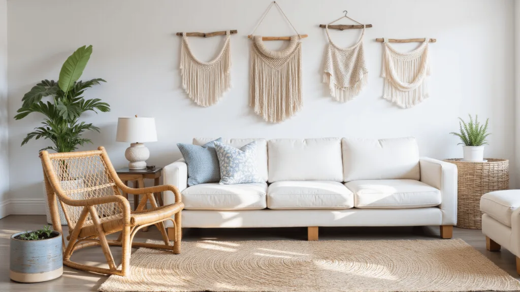
2. Secondary Surprise: Green, Orange, and Purple
Playful. Creative. Unexpected.
Perfect for:
- Artistic spaces
- Bohemian interiors
- Designers wanting to break traditional rules

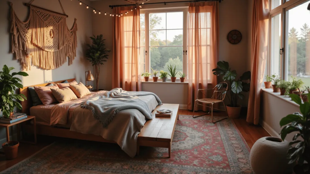
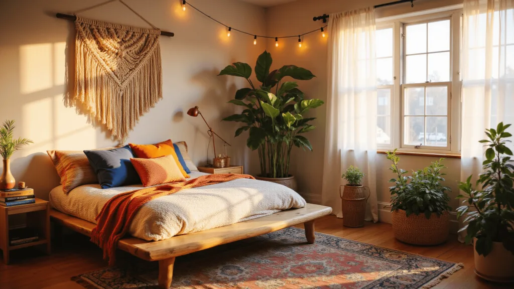
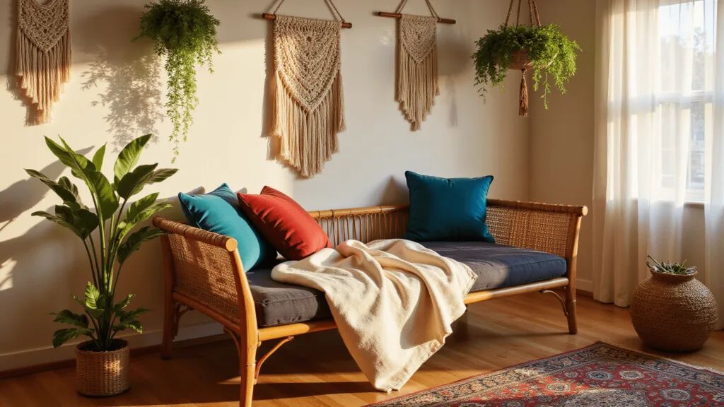
3. Luxe Modern: Teal, Magenta, and Gold
Sophisticated. Rich. Glamorous.
Ideal for:
- High-end living rooms
- Boutique hotel lobbies
- Statement fashion pieces
Smart Color Theory Strategies
Triadic Color Scheme
Imagine the color wheel as a perfect pizza. Choose three slices equally spaced apart. Instant harmony!
Pro Tip: One color should dominate, while the other two play supporting roles.

Analogous Approach
Pick colors sitting next to each other on the wheel. Think blue, teal, green. Smooth. Sophisticated. Serene.

Split-Complementary Magic
Want contrast without chaos? This method is your new best friend.

Practical Color Combination Examples
| Palette Name | Color 1 | Color 2 | Color 3 | Vibe |
|---|---|---|---|---|
| Classic Pop | Yellow | Red | Blue | Bold & Energetic |
| Urban Chic | Teal | Magenta | Gold | Luxe & Modern |
| Nature Zen | Navy | Mint | Beige | Calm & Elegant |

Pro Tips for Color Mastery
- Use online color wheel tools
- Start with one dominant color
- Experiment fearlessly
- Consider room lighting
- Trust your gut feeling
Final Color Wisdom
Remember: Color is personal. What works for a magazine might feel wrong in your space. Your home, your rules.
Embrace imperfection. Play. Explore.
Color combinations are about joy, not rigid rules.
Go forth and color your world beautifully!